After building a WebScraper with BeautifulSoup, I decided to visualize the data with Plotly. Note: for the book data “prices and ratings here were randomly assigned and have no real meaning” as stated by the source website books.toscrape.com because the website it used for testing purposes.
Unfortunately the official documentation is not super helpful and hasn’t been updated in a while, you can tell this because it talks about embedding graphs on tumblr. There is a WordPress plugin for plotly but it hasn’t been updated in 7 years so it doesn’t work with modern WP.
Third parties are more helpful. You can embed charts in WordPress using chart studio iframes and the WordPress custom iframes require a buisness or ecommerce plan, otherwise the code won’t save. Using the HTML tab of chart studio share feature results in a static graph that does save. Like so:

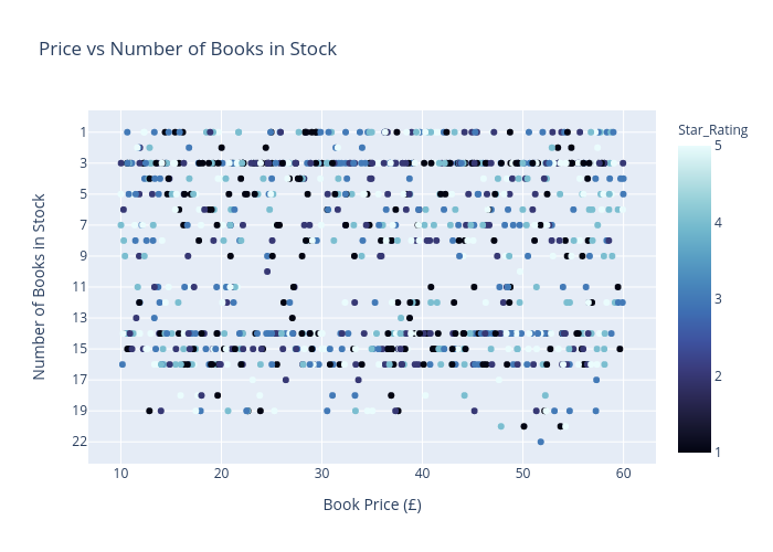
The code to create this graph is pretty simple. Renamed the x and y axes and added an appropriate title. I also included a third variable: star_rating which is discrete and a 1-5 stars as the color for the scatterplot.
For the star ratings, I debated whether or not it is appropriate to use a color gradient from 1-5 or discrete (unordered), and I settled on the former.
import plotly.express as px
fig = px.scatter(df, x='Price£', y='Stock_Status_Num',color='Star_Rating',   color_continuous_scale='ice', labels = {
        "Price£": "Book Price (£)",
        "Stock_Status_Num": "Number of Books in Stock"},
        title ='Price vs Number of Books in Stock')
fig.show()

py.iplot(fig, filename='price-stock-books', auto_open=True)
I can’t see any clear trends. So for the next graph I wanted to see if the how many books there are by star rating
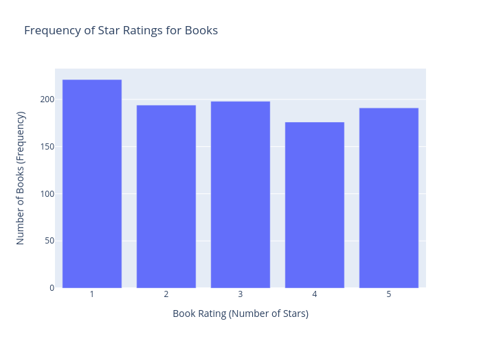
Using pandas, I first grouped by the number of stars and counted the frequency, then added an appropriate title and axes etc:
dfg = df.groupby(["Star_Rating"]).count()
fig = px.bar(dfg, x=dfg.index, y="URL", labels = {
        "Star_Rating": "Book Rating (Number of Stars)",
        "URL": "Number of Books (Frequency)"}, title="Frequency of Star Ratings for Books")
fig.show()
py.iplot(fig, filename='star_freq-books', auto_open=True)
Conclusion
Lots of cool stuff to explore with plotly, especially with creating interactive graphs and dashboards. With more complicated data I could make more interesting and insightful graphs.
